Digital Book of Landscapes 2020

Article

What's new in assessment

Jacqueline McCleod
Associate Landscape Architect

Who am I? Where am I going?

Navigating Sense of Place with Landscape Assessment and Environmental Colour Assessment

Published landscape assessments are routinely used to inform landscape assessment for many of the projects we work on as landscape architects. But did you know they can also be used in lock-step with Environmental Colour Assessment (ECA)?

ECA is a formation of/consideration of a palette of colour that is specific to a geographical area and represents the elements and features of that area. The palette can be used in development planning, and in proposed development, but it could also be used in mitigation proposals. The ECA process should be undertaken in winter because these colours will always be relevant. The National Colour System (NCS) swatch of colours is used to describe the preferred palette.

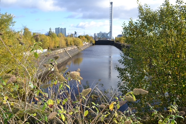
The line where old meets new: Clyde Graving Docks looking towards the financial services district, Glasgow

Landscape architects are well placed to develop specific methodologies for this as we are practiced in considering light, texture, distance and tonality. Although we already consider these elements in our work, having a specific worked methodology and tool to guide this process is helpful. Another advantage of a specific palette is that subsequent development or maintenance work in the area would also work within this thus ensuring a level of continuity. This doesn’t mean everything is muted and boring! In fact, the palettes suggest colours that would accent or ‘pop’ where this is the aim – whilst still being contextually ‘right’.

A Landscape Character Area/Landscape Character Type (LCA/LCT) can form the boundary of a geographic colour palette. However, LCAs/LCTs tend to focus on the physical visual elements and features - the topography, land use, field patterns and built environment. They tend, with the possible exception of the Welsh LANDMAP and associated concept of ‘bro’, to focus a little less on the social and cultural aspects of the area.

As an example, communities may identify with a historic/current large employer where this has shaped the area e.g. Clyde shipyards and their brick buildings, Ravenscraig steelworks, Coalbrookdale or patterns and textures associated with an area e.g. Paisley print, Harris Tweed or Dugdale, Yorkshire. Colours which are present but not suitable because they appear garish can be scoped out.  

Providing ‘familiarity’ is important as studies show that people ‘navigate’ using features that are familiar. The heritage and regeneration industries move in when people don’t know who they are anymore and have to focus on who they were instead.

Therefore, maintaining a sense of place is important to reduce costly intervention measures. Sense of place is also important as we recognise the importance of wellbing and as we enter a generation of aging population and associated dementia issues. Design which embeds suitable palettes in alignment with landscape character and which can respond to the past and provide palimpsest, can respond to the present by creating new development/infrastructure which is landscape led, and can ‘respond’ to the future by considering our future physical and mental wellbeing is what we should all be aiming to achieve.